When I walk into a bookstore or scroll through an online library, the first thing that catches my eye is the book cover. If it’s visually compelling, I’ll pick it up and read the blurb. If it looks unprofessional or confusing, I’ll move on without a second thought.
A book cover is more than just decoration; it’s a visual invitation into the world of the story. Whether you’re an independent author or working with a publisher, the right design can make or break your book’s success. A great cover doesn’t just look good—it communicates genre, tone, and intrigue in a matter of seconds.
In this article, we’ll explore the 8 basic elements of a best-selling book cover, so your book doesn’t just get noticed—it gets picked up and read.
1. Compelling Title and Typography
Your book title is the centerpiece of your cover design. It should be clear, bold, and easily readable, even when displayed as a small thumbnail in online bookstores.
Best Practices for Title Typography:
- Use genre-appropriate fonts (e.g., serif fonts for literary fiction, bold sans-serif for thrillers, elegant scripts for romance).
- Prioritize legibility over decorative fonts.
- Experiment with size and placement to create a strong focal point.
- Ensure high contrast between the text and background.
Successful Example: The Hunger Games by Suzanne Collins uses a simple yet powerful font that reinforces its dystopian theme.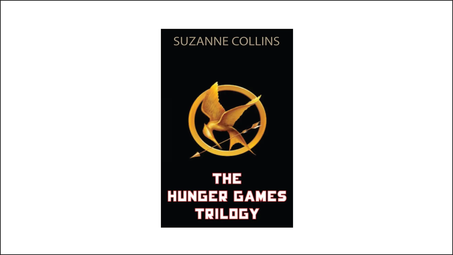
2. Genre-Appropriate Design
A book cover should immediately tell the reader what kind of story they can expect. If your cover design clashes with your book’s genre, it may confuse potential readers and reduce sales.
How to Align Design with Genre:
- Mystery/Thriller: Dark backgrounds, bold fonts, high contrast.
- Romance: Warm colors, soft typography, elegant imagery.
- Science Fiction/Fantasy: Futuristic or medieval elements, ethereal colors.
- Self-Help/Non-Fiction: Clean, minimalist design with professional typography.
Example: The Subtle Art of Not Giving a Fck* by Mark Manson uses a bright orange cover and bold typography, perfectly suited for a disruptive self-help book.
3. Eye-Catching Imagery or Illustrations
A strong visual can evoke emotion and curiosity while reinforcing the book’s theme. The right imagery should enhance, not overpower, the title and typography.
Key Considerations:
- Photography vs. Illustration: Photos are great for realism; illustrations work well for fantasy and children’s books.
- Minimalist vs. Detailed: A clutter-free cover often performs better.
- Symbolism: Use imagery that hints at the book’s themes without giving too much away.
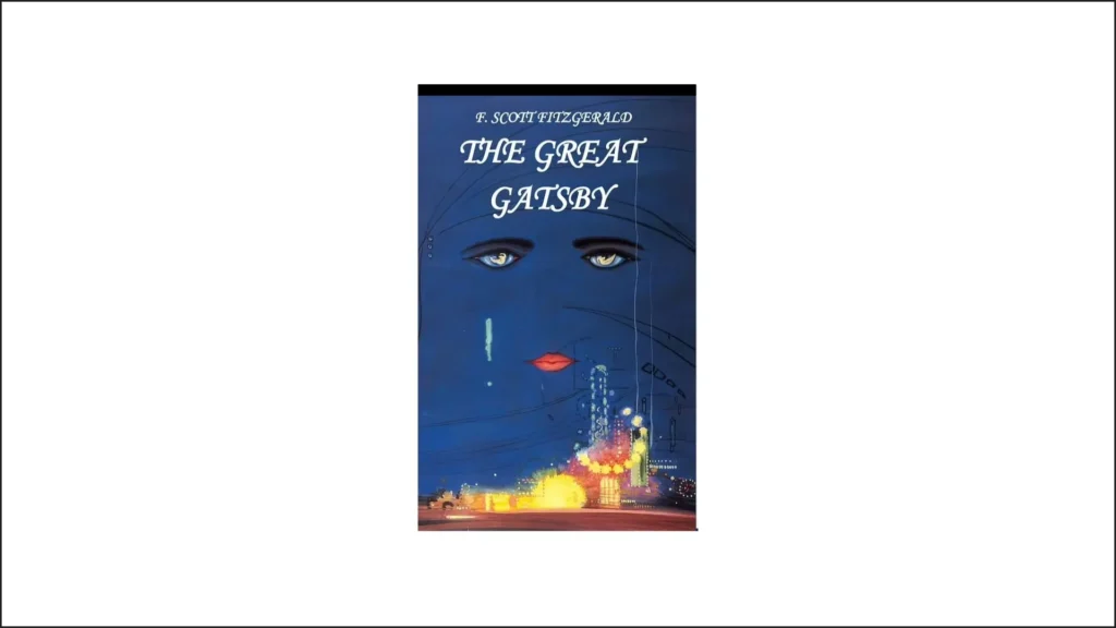
Example: The Great Gatsby by F. Scott Fitzgerald features an iconic illustrated cover that captures the book’s mood and era.
4. The Right Color Palette
Colors play a crucial role in setting the mood and attracting the right audience. The psychology behind colors can influence a reader’s perception and engagement with the book.
5. Strategic Use of Contrast and White Space
A book cover shouldn’t be overwhelming. A balanced design with proper contrast and spacing ensures clarity and visual appeal.
Why This Matters:
- High contrast makes the title and imagery pop.
- White space prevents the cover from feeling cluttered.
- Balanced compositions create a more professional and polished look.
Example: Becoming by Michelle Obama has a clean, well-spaced design that draws attention to the author’s face and title.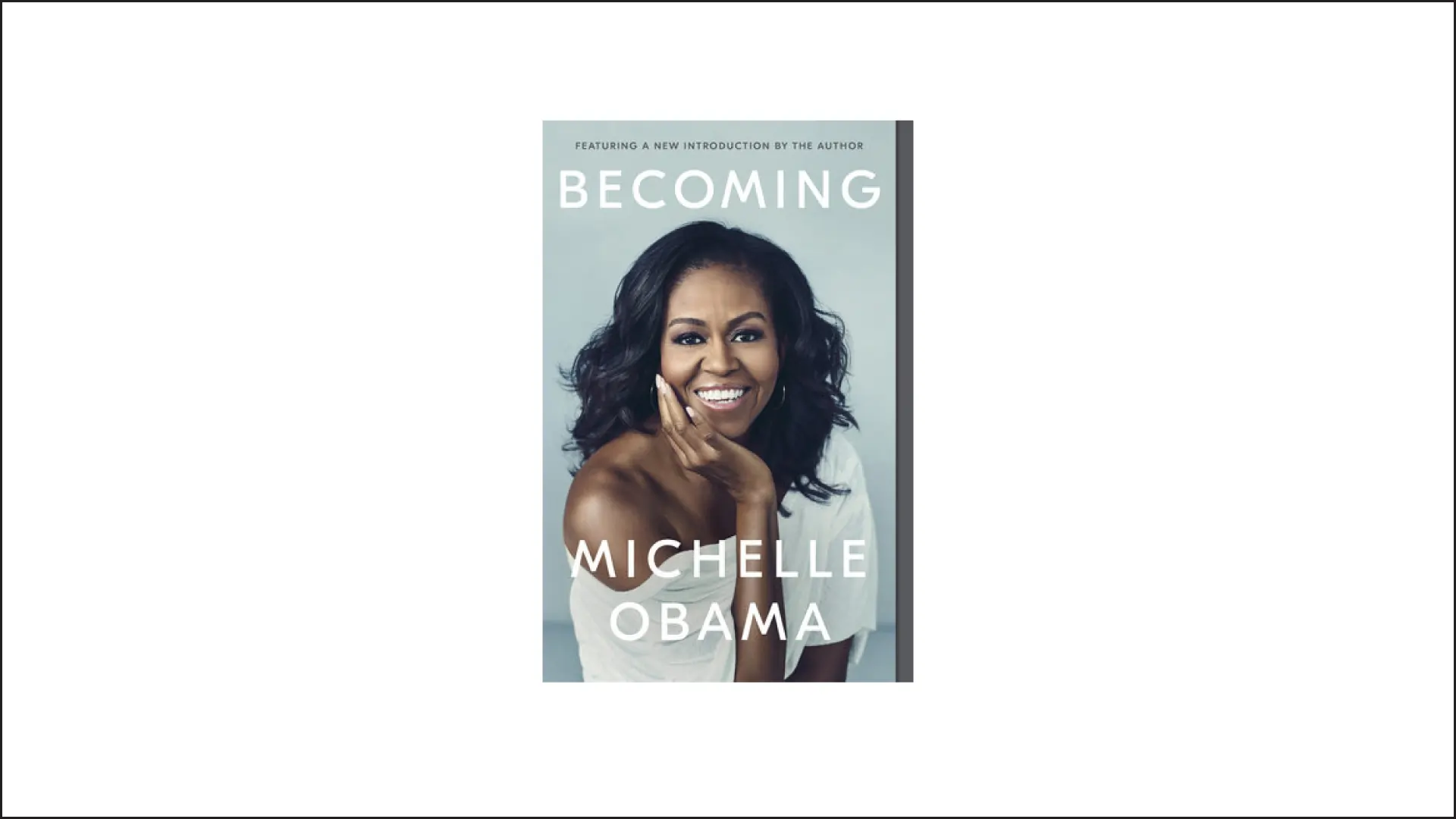
6. Author Name Placement and Branding
For new authors, the book title is the star of the cover. But for established authors, the author’s name can be a selling point.
Best Practices:
- If you’re well-known, place your name in a prominent position.
- Use a consistent font style across multiple books to build brand recognition.
- For debut authors, keep the title dominant and the author name slightly smaller.
Example: Stephen King’s books always have his name prominently displayed, reinforcing his brand.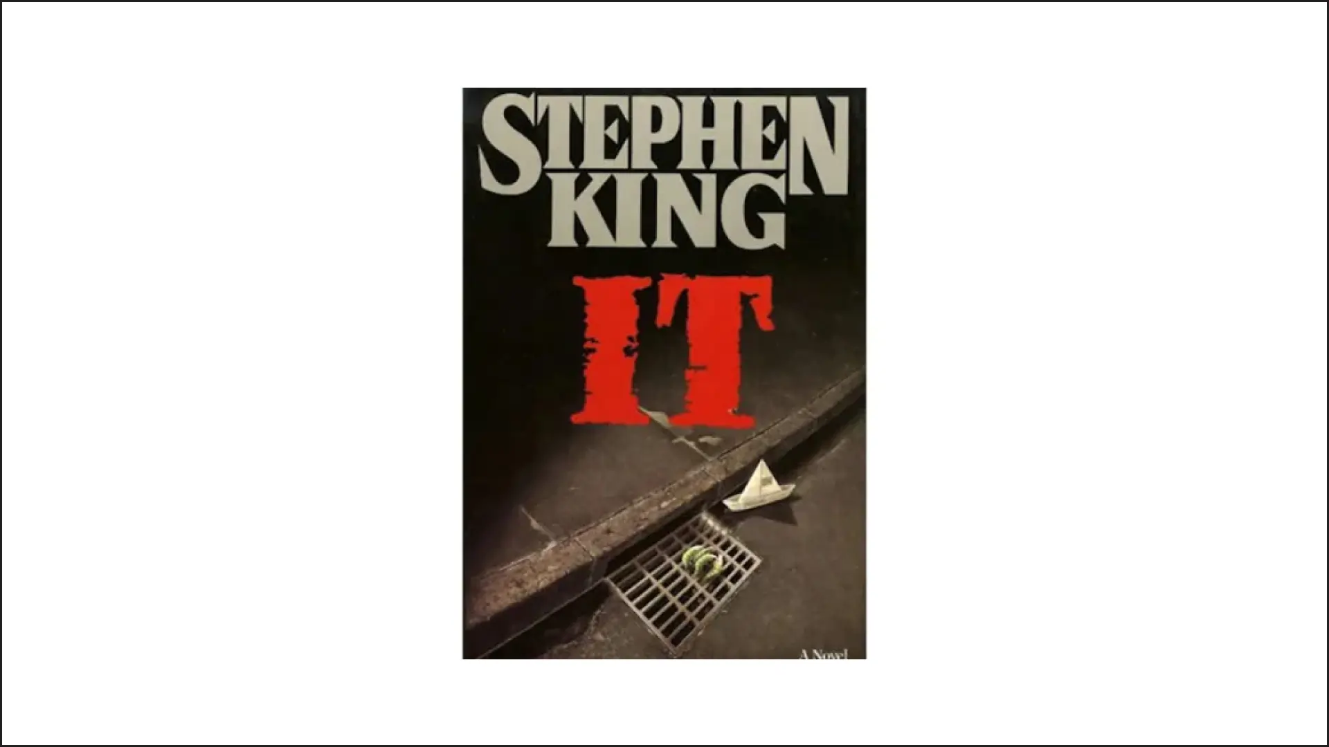
7. Engaging Tagline or Subtitle
A tagline or subtitle provides additional context about the book’s content, especially in non-fiction.
Tips for a Great Tagline:
- Keep it short and intriguing.
- Focus on the book’s core message or promise.
- Use action-oriented language to engage readers.
Example: Atomic Habits by James Clear uses the subtitle “An Easy & Proven Way to Build Good Habits & Break Bad Ones” to clarify its content.
8. Back Cover and Spine Design
While most focus on the front, the back cover and spine play a crucial role in marketing.
Must-Have Elements:
- A compelling book description that hooks the reader.
- Author bio and photo (especially for non-fiction and memoirs).
- ISBN and publisher details.
FAQs about 8 Basic Elements of Best Selling Book Cover
1. Why is a book cover so important for sales?
A book cover is the first thing potential readers see, influencing their decision to buy or skip the book. A well-designed cover grabs attention, conveys the book’s genre, and builds credibility.
2. How do I choose the right typography for my book cover?
Choose a font that matches your book’s genre—serif fonts for literary fiction, bold sans-serif for thrillers, and elegant scripts for romance. Ensure readability even in small thumbnails.
3. What are the best colors for a book cover?
The right colors depend on the book’s theme. Red conveys passion and urgency, blue reflects calmness and trust, and black adds mystery and sophistication. Color psychology plays a key role in reader perception.
4. Should I use illustrations or photography for my cover?
It depends on your book’s genre. Photography works well for realism and non-fiction, while illustrations are great for fantasy, children’s books, and unique branding.
5. How much white space should a book cover have?
A balanced design with proper contrast and white space ensures clarity. Avoid clutter and let key elements (title, imagery, and author name) stand out.
6. Should my name be bigger than the book title?
If you’re a well-known author, placing your name prominently can attract readers. If you’re a debut author, focus on making the title the star of the cover.
7. What makes a great book tagline or subtitle?
A compelling tagline should be short, intriguing, and highlight the book’s core message. It’s especially important for non-fiction books to clarify the book’s purpose.
8. How can I test if my book cover is effective?
Conduct A/B testing with multiple designs, use social media polls for feedback, and ask beta readers which cover grabs their attention the most.
9. Can I design my own book cover, or should I hire a professional?
While DIY covers are possible with tools like Canva, a professional designer ensures marketability, high-quality resolution, and a polished look that appeals to readers.
10. What are common mistakes to avoid in book cover design?
Avoid overcrowded layouts, illegible fonts, misleading imagery, and poor color contrast. A professional and genre-appropriate design is key to attracting the right audience.
Conclusion
A best-selling book cover is a combination of art, psychology, and marketing. It should grab attention, evoke emotions, and align with the book’s genre and message. By focusing on these 8 essential elements, authors can create a visually stunning and marketable book cover that stands out from the competition.
What are some of your favorite book covers? Let us know in the comments below!


