When I designed my first book cover, I realized how much the right font choice impacts the overall design. I spent hours testing different fonts, adjusting sizes, and balancing typography to create a professional and eye-catching look. Through trial and error, I discovered several key principles that every author and designer should consider. If you’re designing a book cover, whether for your own book or a client, these insights will help you pick the perfect font for your book cover.
Example: “Pride and Prejudice” by Jane Austen – Uses a serif font to reflect the book’s timeless elegance.
2. Sans-Serif Fonts
Sans-serif fonts lack decorative strokes, giving them a modern and clean look. These are great for contemporary fiction, sci-fi, and business books.
Example: “Becoming” by Michelle Obama – Uses a simple, bold sans-serif font to create a strong, approachable presence.
3. Script Fonts
Script fonts mimic handwritten or calligraphic styles, making them suitable for romance, poetry, and personal memoirs.
Example: “The Notebook” by Nicholas Sparks – Features a flowing script font that reflects the book’s romantic theme.
4. Display Fonts
Display fonts are unique, decorative, and bold, perfect for grabbing attention in genres like fantasy and thriller.
Example: “Harry Potter” by J.K. Rowling – Uses a custom-designed display font that enhances the book’s magical feel.
Why Font Choice Matters in Book Cover Design
Your book cover font is one of the first things a reader notices. It sets the tone, communicates the genre, and can either attract or turn away potential buyers. A poorly chosen font can make a book look unprofessional, while the right one can instantly grab attention and convey the essence of the story.
Choosing the Right Font Based on Genre
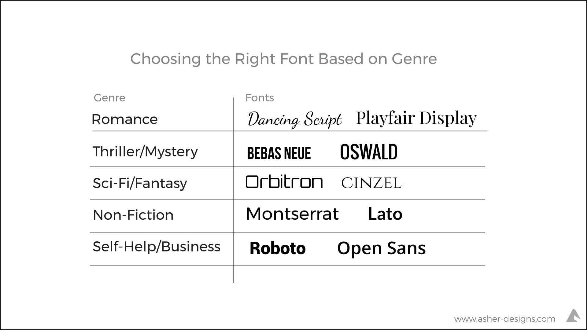
Different book genres require different font styles. Here’s a quick guide:
- Romance – Elegant script or serif fonts (e.g., Dancing Script, Playfair Display)
- Thriller/Mystery – Bold sans-serif fonts (e.g., Bebas Neue, Oswald)
- Sci-Fi/Fantasy – Unique display fonts (e.g., Orbitron, Cinzel)
- Non-Fiction – Simple, professional sans-serif (e.g., Lato, Montserrat)
- Self-Help/Business – Clean, modern sans-serif (e.g., Roboto, Open Sans)

Key Factors to Consider When Selecting a Font
Here are a few essential tips to ensure your font choice enhances your book cover design:
Readability: Ensure the title is legible, even when scaled down for online bookstores.
Scalability: The font should look good in different sizes, from large print covers to digital thumbnails.
Contrast & Hierarchy: Differentiate the title, subtitle, and author name to create a balanced composition.
Uniqueness: Avoid overused fonts like Papyrus or Comic Sans. Choose something distinctive but readable.
Combining Fonts for a Professional Look
Sometimes, using just one font isn’t enough. Pairing fonts can create a visually appealing hierarchy on the cover.
Tips for Combining Fonts:
- Pair a serif with a sans-serif font for contrast.
- Keep it simple: Use a maximum of two fonts.
- Make sure they complement each other in style and weight.
Tools & Resources for Choosing Fonts
Several resources can help you pick the perfect font:
Google Fonts – Free and easy-to-use fonts
Adobe Fonts – High-quality professional fonts
DaFont – A vast library of free and decorative fonts
Font Pair – Helps find the best font combinations
Final Checklist for Choosing the Right Font
Before finalizing your font, go through this checklist:
Is the font readable at different sizes?
Does it match the book’s genre and theme?
Does it create a balanced hierarchy between the title, subtitle, and author name?
Is it visually unique but not over-stylized?
If the answer to these questions is YES, you’ve found the right book cover font!
FAQs about Choosing the Right Font for Book Cover Design
1. Why is font choice important for a book cover?
Font choice plays a key role in conveying your book’s genre, setting the right mood, and attracting potential readers. A well-selected font enhances readability and professionalism.
2. What is the best font for a romance novel cover?
Romance novels often use elegant script or serif fonts, such as Playfair Display or Dancing Script, to create a soft and emotional feel.
3. Can I use more than one font on my book cover?
Yes! A good rule of thumb is to use two complementary fonts—one for the title and another for the author’s name or subtitle. Pairing a serif with a sans-serif font often works well.
4. What are some overused fonts I should avoid?
Avoid cliché or overused fonts like Comic Sans, Papyrus, and Times New Roman. Instead, opt for unique but readable fonts that fit your book’s theme.
5. How do I ensure my font is readable in a small thumbnail?
Choose a bold, clear font with good spacing. Avoid fonts that are too thin, highly decorative, or have excessive flourishes that might become unreadable in small sizes.
6. Are free fonts a good option for book covers?
Yes, but be sure to check their licensing terms. Google Fonts and Adobe Fonts offer many high-quality free fonts for commercial use.
7. What’s the best font for a non-fiction book cover?
Non-fiction books, especially in business and self-help genres, often use clean sans-serif fonts like Montserrat, Lato, or Open Sans to appear modern and professional.
8. How do I match my font with my book’s genre?
Research best-selling books in your genre and analyze their typography choices. Fantasy books often use decorative display fonts, while thrillers tend to have bold sans-serifs.
9. What tools can I use to find the right fonts?
Great resources for font selection include Google Fonts, Adobe Fonts, DaFont, and FontPair (for font combinations).
10. Can a bad font choice affect book sales?
Yes! A poorly chosen font can make your book appear unprofessional, making potential readers less likely to buy it. Fonts contribute significantly to first impressions.
Conclusion
Choosing the right font for a book cover is just as important as selecting the right colors, imagery, and layout. It defines your book’s personality, makes it stand out, and influences potential buyers. Whether you opt for a classic serif font or a modern sans-serif style, always prioritize readability, genre suitability, and design balance.
Are you working on a book cover? Share your font choices in the comments! Need help designing? Let’s create something amazing together.


