Over the years, I’ve designed many script logos for brands that wanted a personal, elegant, and unique identity. Each project taught me something new how the flow of a curve can bring emotion to a design, how the right typography can create a memorable impact, and how a simple flourish can add sophistication. When I work on a script logo, I think beyond aesthetics. I focus on brand storytelling, ensuring that every stroke and curve aligns with the business’s personality. If you’re looking to create a script logo for your business, this guide will take you through the entire process, step by step.
What is a Script Logo?
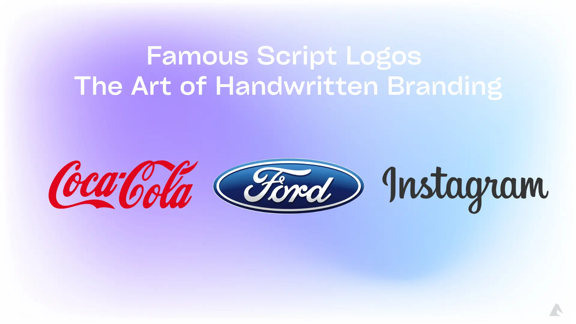
A script logo is a type of logo that features a handwritten or cursive-style font. It mimics natural handwriting, offering a stylish and personal touch to a brand’s identity. Some of the most famous brands, like Coca-Cola, Instagram, and Ford, have script logos that stand the test of time. These logos are often associated with:
- Elegance and sophistication (luxury brands, fashion, beauty)
- Personal connections (coaches, handmade businesses, artisans)

Step 1: Research & Brand Analysis
Before diving into the design, I always start with research. A script logo isn’t just about looking fancy it should align with your brand identity. Here’s what you need to analyze:
Brand Personality: What emotions should the logo convey? Is your brand playful, elegant, or professional?
Target Audience: Who are your customers? Are they drawn to classic or modern aesthetics?
Competitor Analysis: Study successful script logos in your industry and identify what works well.
A script font for a luxury brand should have a smooth and refined flow, while a handwritten style for a casual brand can have a fun, irregular look.
Step 2: Choosing the Right Script Font
Selecting the right font is crucial. Not all script fonts are created equal some are highly decorative, while others are more minimal and clean. Here’s a breakdown of popular script font styles:
- Calligraphy style: Elegant, perfect for wedding brands (e.g., Lavanderia, Allura)
- Retro script: Vintage, bold, and stylish (e.g., Pacifico, Lobster)
- Handwritten script: Casual, friendly, and personal (e.g., Dancing Script, Amatic SC)
- Modern brush script: Energetic and stylish (e.g., Brush Script, Playlist Script)
Always test your script font in different sizes to ensure readability, especially in small prints like business cards.
Step 3: Sketching & Concept Development
Before diving into digital design, I always start with sketches. Sketching allows me to explore different ideas freely, without the constraints of software tools. It helps me experiment with letter connections, flourishes, and overall balance, ensuring the logo has a natural and artistic flow. By refining concepts on paper first, I can create a strong foundation before moving on to digital refinements, resulting in a more polished and well-thought-out script logo. Here’s how you can do it:
- Draw freehand concepts using a pencil or stylus.
- Experiment with different flourishes, loops, and letter connections.
- Focus on balance and flow each letter should connect smoothly.
- Choose 2-3 best concepts and refine them.
- Why sketch first? It helps explore creative ideas without getting restricted by digital tools.
Step 4: Digitalizing the Script Logo
Once you have a strong sketch, it’s time to bring it to life digitally using Adobe Illustrator or similar tools. Here’s the process:
Use the Pen Tool: Convert your sketch into clean vector paths.
Refine strokes: Adjust letter connections for smoothness.
Modify weight & curves: Make sure the thickness is balanced.
Adjust kerning & spacing: Letters should flow naturally without awkward gaps.
Step 5: Customization & Refinements
A script logo isn’t just about letters; it’s about personality and elegance. To refine the design, I incorporate flourishes and swashes, adding extra loops and curls for a more sophisticated look. I also adjust stroke weight, making certain areas thicker to create contrast and visual balance. Additionally, negative space optimization is crucial to ensure the logo remains clear and legible, even in black-and-white versions. These fine-tuned adjustments give the script logo a polished, professional, and distinctive appearance.
Step 6: Choosing Colors & Effects
A script logo’s color scheme plays a vital role in enhancing its style and impact. Black exudes elegance and timelessness, making it a classic choice for premium brands. Gold represents luxury and exclusivity, perfect for high-end businesses. Red conveys passion and energy, ideal for brands that want to make a bold statement. Blue reflects trust and professionalism, commonly used by corporate and tech brands. Meanwhile, green symbolizes nature and sustainability, making it a great choice for eco-friendly and wellness-focused businesses. Selecting the right color ensures your script logo aligns with your brand’s personality and message.
Final Touch: Add subtle gradients or textures to enhance the logo’s look.
Step 7: Testing & Client Feedback
Before finalizing a script logo, I always put it through thorough testing to ensure versatility and clarity. I check how it appears in different sizes, from large billboards to small social media icons, ensuring it remains legible and impactful. I also test it in black and white to confirm that the design holds up without relying on color. Additionally, placing the logo on mockups such as business cards, websites, and packaging helps visualize its real-world application. Client feedback is essential at this stage, as even small refinements can make a significant difference in achieving the perfect final design
Step 8: Finalizing & Exporting the Logo
Once approved, I export the logo in various formats:
- PNG (Transparent background for websites & social media)
- SVG (Scalable without losing quality)
- AI & EPS (Editable vector formats for printing)
- PDF (High-quality print format)
This ensures the logo is ready for all branding purposes!
Global Usage Comparison: Script Logos vs. Monogram Logos
| Aspect | Script Logos | Monogram Logos |
|---|---|---|
| Usage Percentage | Used by 42% of brands in fashion, beauty, and creative industries | Used by 58% of brands, mainly in corporate and luxury sectors |
| Industries | Fashion, beauty, food, creative businesses | Tech, automotive, law firms, high-end brands |
| Brand Recognition | Strong emotional appeal, preferred by 65% of consumers for brands with personal connections | Higher recall rate (75%) in industries with established corporate identity |
| Example Brands | Coca-Cola, Instagram, Ford, Cadbury | IBM, Louis Vuitton (LV), HP, Gucci |
| Consumer Preference | 53% of consumers associate script logos with elegance and trust | 60% of consumers find monogram logos more professional and authoritative |
These brands prove that script logos can be timeless and effective.
Conclusion: Why a Script Logo is a Smart Choice
Designing a script logo requires creativity, attention to detail, and an understanding of branding. It’s more than just picking a fancy font it’s about creating a visual identity that resonates with your audience. A well-designed script logo can:
Make your brand memorable
Build emotional connections with customers
Give a unique, handcrafted feel to your brand
If you want a professional, custom script logo, investing in an expert designer is the best choice. A great logo is the face of your brand make sure it tells the right story!


