TL;DR: A visual identity system is your brand’s visual backbone—logos, fonts, colors, and more. It makes you instantly recognizable. It helps build trust and consistency across everything from websites to social posts. For startups, it’s a smart early investment that saves time and grows credibility.
In the early days of your startup, you’re probably juggling a dozen things: product development, customer feedback, investor meetings, and maybe even assembling your first team. But there’s one thing that often gets pushed aside: your brand’s visual identity system. And that’s a costly mistake.
Because when your brand looks inconsistent, unclear, or forgettable so, it’s hard to build trust. That’s where a solid visual identity system becomes one of the most important investments you can make early on.
Let’s break it all down in plain terms with practical tips you can actually use (even on a tight budget).
Table of Contents
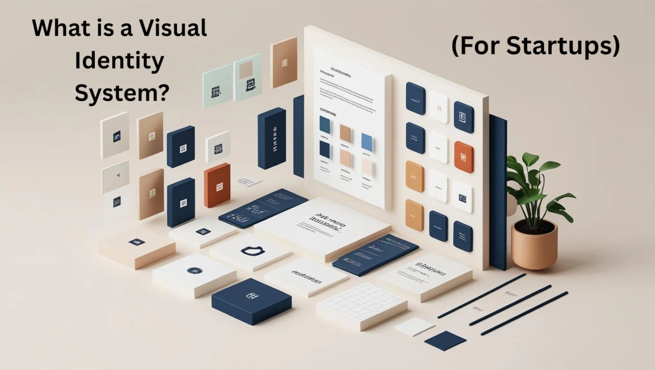
What is a Visual Identity System?
A visual identity system is the complete set of visual elements that your brand uses to present itself across all touchpoints. It’s not just a logo or a color scheme. It’s the entire visual language your brand speaks. Think of it like the design blueprint that keeps your startup’s presence consistent, professional, and instantly recognizable.
This system includes key elements like:
- Logo and logo variations: Your logo is your brand’s face. Variations (horizontal, stacked, icon-only) ensure it works across digital, print, and social platforms without losing recognition.
- Color palette: A defined set of brand colors, including primary, secondary, and accent tones. These help create emotional associations and maintain visual harmony.
- Typography: Fonts and how they’re used shape your brand voice. A clear hierarchy (headings, subheadings, body text) improves readability and strengthens brand personality.
- Imagery and illustration style: From photography to icons, consistent visual storytelling helps convey mood, values, and tone.
- Design patterns and layouts: These guide the structure of things like web pages, brochures, and social posts, ensuring brand consistency across mediums.
- Iconography: A unique icon style adds clarity and cohesion to complex information or digital interfaces.
- Brand guidelines: This master document explains how to use all the above branding elements correctly, keeping everything aligned as your business scales.
If your brand is a person, the visual identity system is how it dresses, speaks, and shows up in the world.
And this isn’t just about looking pretty. Consistent visual identity directly impacts how trustworthy, memorable, and professional your startup feels to customers.
📌 Related Reading: Types of Graphic Design Services
Why Startups Need a Visual Identity System
Startups rarely get a second chance to make a first impression. In the early days, every detail matters. When your brand visuals feel scattered, outdated, or amateur, it subtly signals that your business might be disorganized or unprofessional. On the flip side, when your visual identity system is consistent across your website, pitch decks, packaging, social profiles, and even emails, it shows people you take your brand seriously. And that builds trust.
1. You Need to Stand Out in a Crowded Market
Startups often compete in saturated spaces. Whether you’re launching a SaaS tool, a lifestyle product, or a mobile app, visual branding helps you get noticed. A unique color scheme, custom illustrations, or even a signature typeface can help you stand out from competitors who all start to look the same.
2. Trust Grows Through Consistency
People trust what they recognize. According to Forbes, consistent brand presentation across platforms can increase revenue by up to 23%. A unified visual brand identity builds that recognition, helping you earn credibility long before customers understand all your offerings.
3. It Guides Every Creative Decision
A solid visual identity system acts like a north star. It makes design decisions easier, from your product UI and onboarding emails to business cards and investor decks. Instead of starting from scratch every time, you’re working from a system that reflects your brand voice and goals. It saves time, eliminates guesswork, and keeps everything aligned.
Your visuals aren’t just decoration. They’re part of your business strategy.
Real Startup Examples (Mini Case Studies)
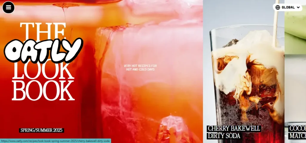
1. Oatly: Rebellious, Raw, and Human
Oatly’s quirky illustrations, mixed fonts, and unpolished design style match its bold voice and mission. The visual identity feels as disruptive as the product itself.
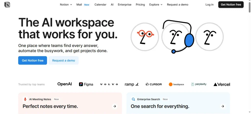
2. Notion: From Minimal to Memorable
Notion’s visual identity uses a monochrome palette and simple typography. It reflects the clean, modular structure of their product and makes their branding instantly recognizable in a crowded productivity market.
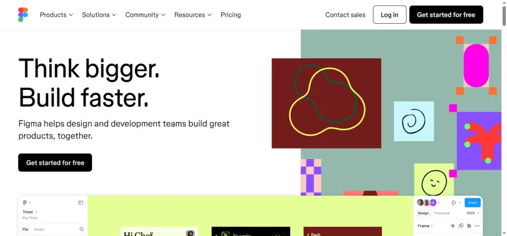
3. Figma: A Playful, Design-Led Identity
Figma’s colorful UI and smooth curves in its logo align perfectly with its target audience: designers. Their identity system makes them feel creative and cutting-edge.
These brands didn’t just pick nice colors or fonts. They aligned their visual identity with who they are and what they offer.
Why Startups Struggle With Visual Identity
You’re not alone if you’ve postponed your branding or patched together assets from different sources. Here’s what typically gets in the way:
- Limited Budget: Most early-stage startups can’t afford a full brand agency. That’s okay. You can start small with the essentials and then expand.
- No In-House Designer: Without someone leading your design vision, you end up with freelancers using different styles, and it shows. That’s why systems are so helpful: they act as your creative compass.
- Rapid Growth = Brand Drift: As you grow, more people start creating marketing materials, sales decks, and landing pages. Without a system in place, your visuals start to drift. And suddenly, your brand feels like a Frankenstein.
Pro insight: The faster you’re growing, the more important a brand system becomes.
Common Visual Identity Mistakes to Avoid
- Inconsistent Logo Usage: Using distorted, resized, or poorly placed logos dilutes your identity.
- Random Font Pairings: Mixing fonts without a defined hierarchy makes your brand look amateur.
- Color Chaos: Unplanned color usage confuses your message and weakens recognition.
- Copycat Designs: Borrowing too much from competitors makes your brand forgettable.
🛠️ Fix it: Stick to your guidelines. Review all assets regularly. And don’t be afraid to evolve—just not every quarter.
How to Build a Visual Identity System (Even Without a Design Team)
You don’t need a big-budget agency to create a strong, cohesive brand. If you’re an early-stage startup, solo founder, or creative bootstrapping your business, here’s a simple, hands-on process to build a professional visual identity system from the ground up.
Step 1: Define Your Brand’s Core Identity
Before diving into colors and logos, start with your brand foundation. What’s your mission? Why do you exist? What values guide your work? Are you playful or premium? Disruptive or dependable? This emotional groundwork shapes your entire brand personality, influencing design decisions that feel authentic and aligned.
Step 2: Know Your Target Audience
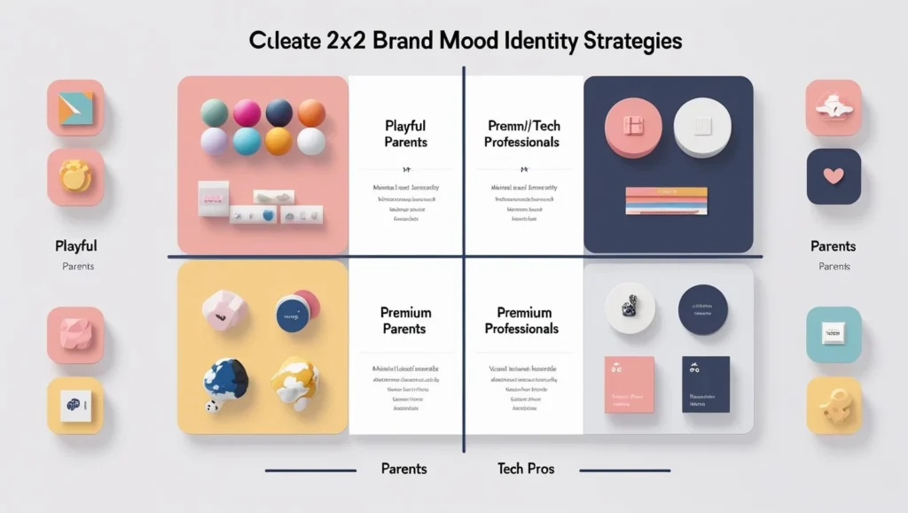
Design with purpose. Who are you trying to connect with, and what appeals to them visually? A minimalist, modern look may resonate with tech-savvy professionals, while a fun, vibrant style could attract parents or young creators. This insight helps you avoid generic branding and instead craft a visual identity that builds an emotional connection.
Step 3: Design a Logo That Captures Your Essence
Your logo should be simple, flexible, and memorable. Create a core version, plus variations: horizontal, stacked, icon-only, and favicon for web use. A well-designed logo acts as your brand anchor, ensuring instant recognition across platforms.
Step 4: Choose Your Visual Language
- Color Palette: Select 1–2 main brand colors, supported by neutrals and 1–2 accent tones. Use color psychology to create the right mood.
- Typography: Pick 1–2 font families that reflect your tone. Define usage rules for headings, subheadings, body text, and UI labels.
- Imagery Style: Decide if you’ll lean into photography, illustrations, or icon sets. Keep the mood, lighting, and treatment consistent across assets.
Step 5: Build a Simple Brand Style Guide
Even a short 5-page PDF can bring clarity. Document your visual identity guidelines—logo usage, brand colors, fonts, tone of imagery, and common do’s and don’ts. This guide ensures brand consistency even as your team grows.
Step 6: Apply It Across Every Touchpoint
Use your system consistently: website, social media, investor decks, packaging, newsletters. The more cohesive your visuals, the stronger your brand recognition becomes. Repetition builds familiarity, and familiar brands are trusted brands.
Would you like a downloadable style guide template or an infographic suggestion for this section?
Aligning Visual Identity With Brand Strategy
Your visual identity isn’t how your brand looks. It should reflect how your brand thinks and operates. Ensure your visual system mirrors your mission, vision, values, and tone of voice. If you’re a customer-first, community-driven startup, your visuals should feel warm, inclusive, and human, not cold and corporate.
✔️ Summary Box: Quick Tips
- Start with core values, then design
- Design for your specific audience, not just aesthetics
- Consistency builds trust
- Reuse and adapt elements for speed and scalability
Helpful Tools for Startups
You don’t need an agency to get started. Here are great tools:
- Canva Pro – Easy templates and brand kits
- Adobe Express – Great for quick branded content
- Frontify – Create brand guidelines and share assets
- Looka – Logo and brand kit generator for non-designers
When to Outsource
If you need polish, hire a freelance designer for just the system, not a full brand. Platforms like Upwork or Contra have vetted creatives at different budget levels.
Related post coming soon: How to Work With a Freelance Designer as a Startup Founder
Evolving Your Visual Identity System Over Time
Your brand isn’t static, it’s a living, evolving entity. As your startup grows, pivots, or enters new markets, your visual identity system should grow with it. The key is knowing when to evolve and how to do it without losing your brand’s core identity.
1. Run Regular Brand Audits
Set a reminder to audit your brand every 6 to 12 months. Review all visual materials, website, pitch decks, social posts, and product packaging and ask: Does everything still feel cohesive? Are your new assets still aligned with your brand guidelines, or are things starting to drift? This habit helps maintain visual consistency and spot misalignments early.
2. Adapt as You Scale
Your initial identity design doesn’t have to be flawless. What matters most is starting with a clear structure. As your startup scales, refine your branding elements with purpose. A strong visual branding foundation prevents chaos, especially when more people start creating assets.
3. Stay Relevant Without Losing Yourself
Design trends change. You don’t need to chase them, but a subtle brand refresh every few years can modernize your look. Avoid major overhauls too often, or you risk confusing your audience and weakening your brand recognition.
Quote from experience: “One of my startup clients changed their logo three times in two years—each time, they lost momentum with their audience. Consistency wins.”
Final Thoughts: Visual Identity is Strategy, Not Just Design
If you take anything from this guide, let it be this: your visual identity system is more than aesthetics, it’s strategy.
Startups who treat their brand visuals as a system (not scattered assets) build stronger connections, look more credible, and grow faster.
So whether you’re DIYing it on Canva or hiring a designer to build your first brand guide, invest in making it consistent, intentional, and human.
👉 Keep learning: Dive deeper into Types of Graphic Design Services to see where visual identity fits in your startup’s design roadmap.
FAQs
1. What does a visual identity system include?
A visual identity system includes your logo, color palette, typography, imagery style, iconography, and design layouts, all documented in brand guidelines. Together, these elements create a cohesive and recognizable look across every platform, from your website to pitch decks and social media.
Why is a visual identity system important for startups?
A visual identity system helps startups build trust, stand out in crowded markets, and present a professional brand from day one. It keeps your visuals consistent across channels, saves time on creative decisions, and supports faster brand recognition as you grow.
How do I create a visual identity system without a designer?
Start by defining your brand’s mission and values, then use tools like Canva, Looka, or Adobe Express to build your logo, select brand colors, and choose fonts. Document these choices in a basic style guide so you can stay consistent as your brand scales.
What’s the difference between a logo and a visual identity system?
A logo is just one piece of your visual identity system. The full system includes your entire visual language, colors, fonts, layouts, imagery, and usage rules that together create a unified brand experience across all touchpoints.
How often should startups update their visual identity system?
Startups should review their visual identity system every 6 to 12 months. Update only when necessary—such as during a rebrand or major product shift. Avoid frequent redesigns to maintain brand consistency and recognition.
Can inconsistent branding hurt my startup?
Yes. Inconsistent visuals can make your startup look disorganized and untrustworthy. When logos, fonts, or colors don’t match across materials, it creates confusion and weakens your credibility, especially during early-stage growth when first impressions matter most