TL;DR: Good UI is clear, consistent, and considerate. This guide gives you 10 core principles to help you build interfaces people want to use.
When users land on your product, they don’t see your wireframes, dev hours, or clever backend, they see your interface. And if that interface feels cluttered, confusing, or inconsistent? You’ve lost them.
Whether you’re a startup founder polishing your MVP, a student building your first portfolio piece, or a creative pro trying to sharpen your UX skills, understanding user interface design principles is crucial. These principles aren’t just theory. They shape how people feel when they use your product.
In this post, we’ll break down 10 timeless UI principles that help you design cleaner, smoother, more user-friendly interfaces, along with real-world examples and actionable tips you can start using today. We’ll also touch on UI design best practices, usability principles, mobile UI design guidelines, and more to ensure your work stands out.
By the end, you’ll know exactly what separates an “okay” UI from one that feels intuitive and delightful.
Table of Contents
1. Clarity: Make the Interface Instantly Understandable
Ever landed on a website and spent five minutes trying to figure out where to click? That’s what happens when clarity is missing.
Clarity is about making sure users instantly understand what they can do and where to go. No guesswork. This principle supports usability and sets the tone for an intuitive experience.
If users have to stop and decode the UI, they’ll bounce.
How to Improve Clarity:
- Use straightforward language. Instead of “Submit,” say “Send Message” or “Create Account.”
- Use familiar icons. Don’t invent a new symbol forsearch; use the magnifying glass. Lean on common patterns.
- Reduce visual clutter. Less noise means more focus. Eliminate redundant or decorative elements that distract.
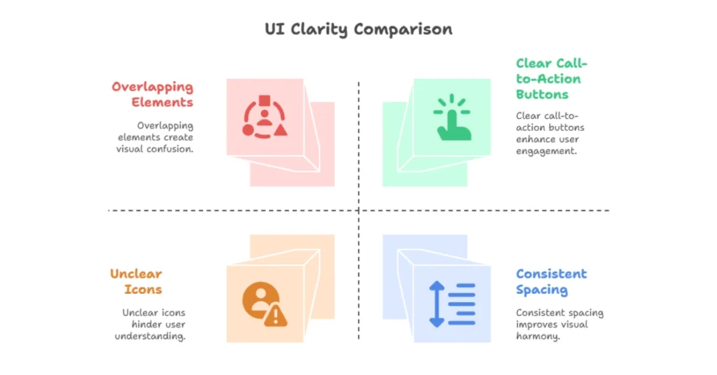
Takeaway: Clear interfaces create trust. Confusing ones create friction.
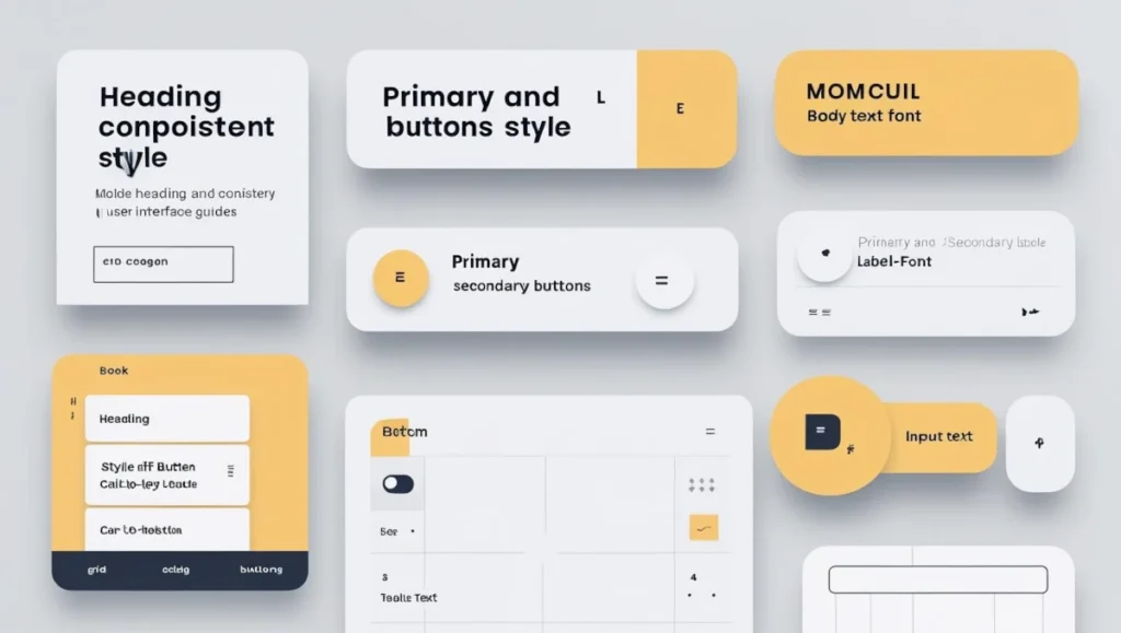
2. Consistency: Build Trust with Repetition
Imagine opening an app where every screen uses different fonts, colors, or button placements. You’d feel lost and likely close it.
Interface consistency builds familiarity. It’s a core part of user-centered design principles and crucial for usability. When patterns repeat across screens, users can predict interactions and feel more confident navigating.
Consistency supports interface clarity, improves visual hierarchy, and reduces the user’s cognitive load.
How to Maintain Consistency:
- Use a design system or style guide to keep typography, buttons, and spacing uniform.
- Repeat layout patterns like placing primary actions in the same spot or keeping navigation fixed.
- Align micro-interactions such as hover states, transitions, and error handling across the interface.
- Standardize color coding, for example, using the same shade of blue for all call-to-action button
Pro Insight: In early-stage startups, UI inconsistency often stems from fast MVP development. However, addressing it early improves user trust, reinforces your brand identity, and reduces support tickets.
3. Feedback: Let Users Know What’s Happening
Ever click a button, and nothing happens? You pause for a moment, unsure—did it register? Should you wait? Maybe the site is frozen. That uncertainty creates instant frustration. It’s a small moment, but one that can make or break user trust.
Users need reassurance. Whether it’s a subtle animation, a quick sound cue, or a visual response like a spinner or progress bar, feedback lets them know the system is working. Without it, they’re left guessing and likely clicking again, refreshing the page, or leaving entirely.
In UI design, these feedback mechanisms aren’t just nice-to-haves. They’re fundamental to creating smooth, predictable, and stress-free experiences.
Feedback mechanisms in UI are essential. They reassure users their actions were registered.
How to Add Feedback:
- Show loading indicators for longer actions.
- Use animations or micro-interactions to confirm inputs.
- Provide success and error messages that are friendly and specific.
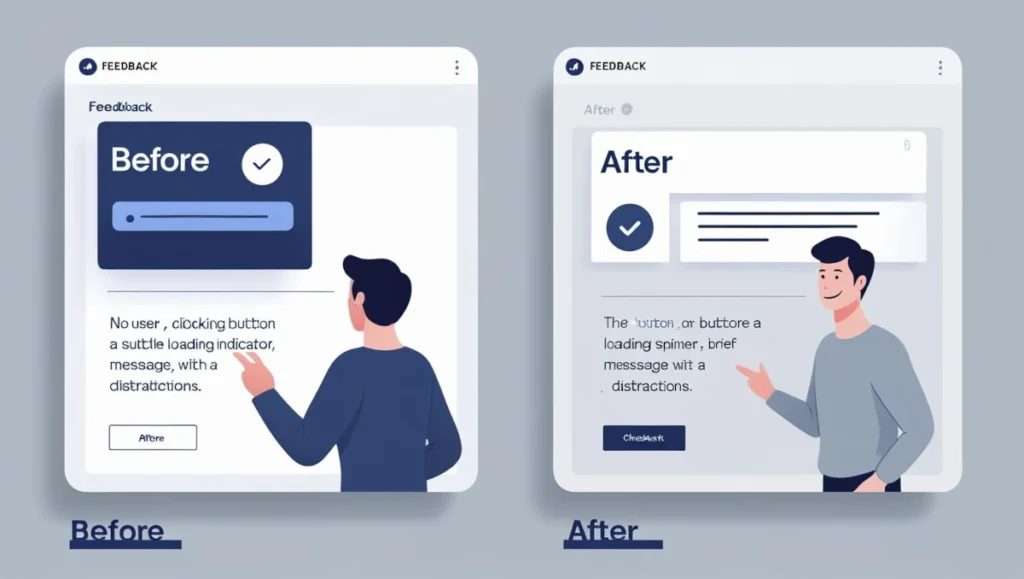
Takeaway: Feedback closes the loop and makes the interface feel alive.
4. Simplicity: Don’t Make Them Work for It
Simplicity is one of the hardest things to get right, especially when you’re proud of your product and want to showcase everything it can do. But showing too much too soon overwhelms users. Clean, focused design helps users stay on task, reduces friction, and makes your interface feel approachable. In user interface design, clarity and minimalism often outperform feature-heavy clutter. Simplicity is about smart prioritization, not limitation.
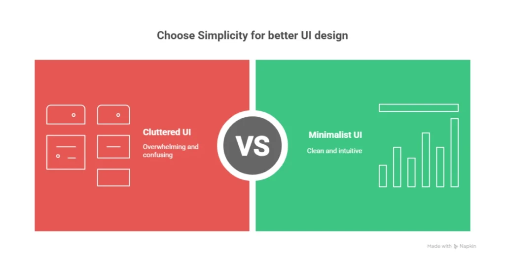
Simple UI doesn’t mean basic. It means focused.
Users want to finish a task, not admire your layout.
Keep It Simple By:
- Eliminating unnecessary options.
- Grouping related actions logically.
- Using progressive disclosure to reveal advanced settings only when needed.
Pro Tip: The best apps feel easy because they hide complexity until it’s needed.
5. Accessibility: Design for Everyone
There are over 1.3 billion people globally with disabilities, a significant portion of your potential user base. Your UI must be inclusive, accessible, and designed to support diverse needs, not just optimized for the ‘average’ or most able-bodied user. Prioritizing inclusive design and universal accessibility helps ensure your product works for everyone, including users with visual, auditory, motor, or cognitive impairments. This not only broadens your audience reach but also demonstrates ethical responsibility and boosts usability for all users, regardless of ability.
Accessibility in UI design ensures no one gets left out.
How to Design Accessible Interfaces:
- Use sufficient contrast between text and background.
- Ensure keyboard navigation works properly.
- Use semantic HTML and ARIA labels to support screen readers.
- Make interactive elements touch-friendly and properly labeled.
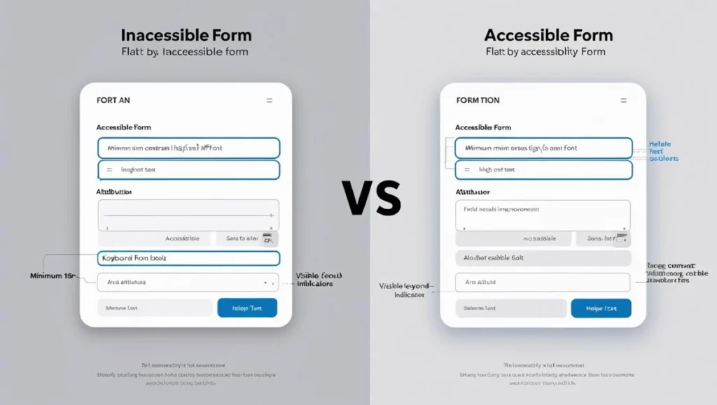
Takeaway: Accessibility isn’t optional. It’s your responsibility.
6. Visual Hierarchy: Guide the Eye with Intention
Users don’t read interfaces. They scan them, looking for visual cues, patterns, and elements that stand out. In fast-paced digital environments, attention is limited, so your UI must communicate hierarchy and function instantly. That’s why scannability is core to intuitive design.
Visual hierarchy in UI helps direct attention by signaling what’s most important.
How to Build Visual Hierarchy:
- Use size, contrast, and spacing intentionally.
- Create focal points using bold headings and distinct buttons.
- Group related items using containers or proximity.
Quick Tip: Remove all colors and squint. If the layout still makes sense, your hierarchy is solid.
7. Affordance: Make Clickables Feel Clickable
If it looks like a button, it should act like one.
Affordance in UI design is about clearly signaling what elements users can interact with without needing to guess. When a button looks tappable or a card appears swipeable, that’s affordance in action. It leverages visual cues like shadows, textures, and feedback states to guide behavior. Good affordance improves usability by reducing hesitation and ensuring interactions feel natural. Whether it’s clickable buttons, draggable items, or scrollable sections, strong affordance supports intuitive interaction design, visual feedback, and overall user experience flow.
How to Improve Affordance:
- Use shadows, borders, and hover states for interactive items.
- Avoid flat designs that hide functionality.
- Label icons clearly and avoid ambiguous design patterns.

Takeaway: Users shouldn’t have to guess. Design should suggest action.
8. Flexibility: Support Different User Preferences
Not everyone interacts with your product the same way. Flexibility boosts usability by adapting to different user needs, preferences, and devices. Supporting varied workflows like keyboard shortcuts, dark mode, or responsive layouts, helps users feel in control. It’s a key aspect of user-centric, inclusive UI design.
Responsive interface design supports a variety of screens, workflows, and preferences.
Add Flexibility By:
- Offering undo or redo options.
- Allowing personalization like themes or saved views.
- Supporting keyboard shortcuts and mobile gestures.
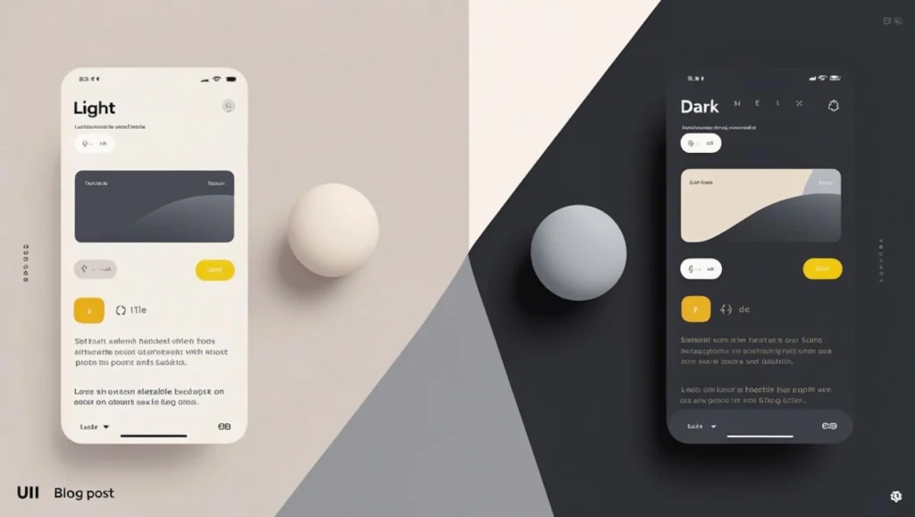
Pro Insight: Even small customizations make users feel seen. Flexibility increases retention.
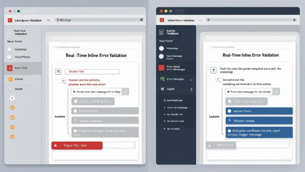
9. Error Prevention and Recovery: Don’t Punish Mistakes
Mistakes will happen; it’s inevitable. But a well-designed UI shouldn’t make errors worse or harder to recover from. Instead, it should guide users gently back on track, reduce frustration, and clearly communicate what went wrong and how to fix it. Strong error handling improves the overall user experience, boosts user trust, and reinforces product reliability.
Preventing and recovering from errors is a fundamental aspect of interaction design, ensuring users can avoid mistakes or bounce back quickly when things go wrong, supporting smoother UX, user trust, and overall usability.
How to Help Users Recover:
- Use confirmation dialogs for destructive actions.
- Validate forms in real-time and provide clear error messages.
- Allow undo and explain how to fix problems when they occur.
Takeaway: Recovery is part of the experience. Help users get back on track.
10. Aesthetic Integrity: Form Matches Function
Yes, looks matter, but only when they reinforce usability and purpose. A visually appealing interface should enhance clarity, guide interaction, and support the overall function, not distract from it or hinder the user experience.
Aesthetic integrity means your interface feels consistent with what it does.
How to Maintain Aesthetic Integrity:
- Match visuals to your product’s tone. A finance tool should feel trustworthy. A game should feel fun.
- Use consistent iconography and illustration style.
- Avoid over-styling or trends that harm usability.
Pro Insight: Great UI builds emotional confidence. It shows care and attention to detail.
Conclusion: Interfaces That Work, and Win Users
Designing intuitive interfaces doesn’t happen by accident. It comes from understanding and applying user interface design principles that prioritize clarity, usability, and user delight.
To recap, the principles we covered are:
Clarity, Consistency, Feedback, Simplicity, Accessibility, Visual Hierarchy, Affordance, Flexibility, Error Recovery, and Aesthetic Integrity.
When combined with UI design best practices like feedback loops, interface consistency, and accessibility-first thinking, these principles help you build clean, usable interfaces, especially for startups, students, and solo creators trying to make a meaningful impact.
If you’re exploring different kinds of design support, check out our full guide to types of graphic design services to see where UI design fits in the bigger picture.
Next Step: Want to sharpen your brand visuals next? Don’t miss our deep dive on visual identity systems—a key step in building a design foundation that scales.
FAQs
What are the core principles of UI design?
The core UI design principles include clarity, consistency, feedback, simplicity, accessibility, visual hierarchy, affordance, flexibility, error recovery, and aesthetic integrity. These foundational ideas help designers create interfaces that feel intuitive, look polished, and guide users through tasks without friction.
Why is visual hierarchy important in UI design?
The core UI design principles include clarity, consistency, feedback, simplicity, accessibility, visual hierarchy, affordance, flexibility, error recovery, and aesthetic integrity. These foundational ideas help designers create interfaces that feel intuitive, look polished, and guide users through tasks without friction.
How can I make my UI design more accessible?
To improve accessibility, use high contrast text, ensure keyboard navigation works, add alt text and ARIA labels, and design for screen readers. Also, make interactive elements large enough to tap and readable on all devices. Accessible design benefits everyone—not just users with disabilities.
What’s the difference between UI and UX design principles?
UI design principles focus on the look and behavior of the interface—layout, buttons, visuals—while UX design principles cover the overall experience, like user flow, satisfaction, and task efficiency. UI is how it looks and feels; UX is how it works and supports user goals.
How do I apply simplicity without losing functionality in UI design?
Simplicity doesn’t mean removing features—it means showing the right things at the right time. Group-related actions use progressive disclosure to hide advanced options and reduce visual noise. The goal is to help users focus, not limit what they can do.
What is affordance in UI, and why does it matter?
Affordance is how an element visually suggests what it does. A button should look clickable. A swipeable card should feel draggable. When affordance is strong, users know how to interact without thinking. It reduces friction and makes interfaces more intuitive.
